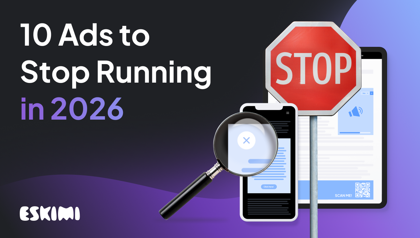
10 Ads to Stop Running in 2026 (Seriously, Please Stop)

Let’s face it: some ads still suck. Loudly.
In a world where attention is earned per second, not bought per impression, bad creative is a brand killer.
Not annoying in a fun way. Just annoying. The kind that gets muted, skipped, or memed (and not in the good way).
1. Audio ads that honk while you’re driving
You’re stuck in traffic. The ad honks. You panic. The brand gets remembered, but not in a good way.
Why this needs to go: 74% of audio listeners say annoying or startling sounds ruin their experience. And that’s a fast track to brand rejection + potential accidents.
2. Static banners with 54 words and a paragraph of T&Cs
If your banner ad reads like a legal disclaimer, it’s doing too much.
Why this needs to go: Static ads are outperformed 3:1 by rich media. Eskimi’s own campaigns saw 288% more engagement with dynamic formats.
3. Auto-play video with the volume ON
You’re scrolling at night. Suddenly, BOOM — ad jingle. The dog barks, your kid wakes up, and the brand goes on your blacklist.
Why this needs to go: 96% of mobile users say they hate unexpected sound. If your ad starts with noise, expect users to end it, fast.
4. Retargeting ads for shoes you already bought
Thanks for the ad. I already bought the sneakers. Two weeks ago.
Why this needs to go: 41% of users say irrelevant retargeting makes them think a brand doesn’t get them or have no control. Fix those burn pixels!
5. QR codes in digital ads with zero context
No caption. No CTA. Just a random QR code floating in a corner like a mystery challenge.
Why this needs to go: 67% of people won’t scan a QR code unless they know where it leads. Mystery ≠ motivation. Targeting mobile users as well? How will they scan?
6. Mobile ads with tap targets smaller than an ant
You try to close the ad but tap the CTA. You try again. Miss again. Rage quits incoming.
Why this needs to go: We recommend 48px minimum for tap targets. If you’re smaller than that, you’re just farming misclicks.
7. Banner ads that still say "Click here!"
We know how buttons work. It’s 2026.
Why this needs to go: Outdated CTAs take up space and insult the user’s intelligence. Want clicks? Write something worth clicking.
8. Gamified ads with no game logic
You tap a ball. It bounces once. Game over. Huh?
Why this needs to go: Proper gamified ads increase brand favorability by up to 20%, but only when the interaction actually makes sense.
9. Pre-roll ads longer than the content
You click a 10-second video. But first? A 30-second ad. Unskippable. Cool.
Why this needs to go: Long pre-roll ads cause 3X higher drop-off rates when the content is short. That’s not reach, that’s repulsion.
10. Huge logos. Tiny messaging.
If your logo takes up 60% of the ad, and your message is a footnote — you’ve inverted the whole point of communication.
Why this needs to go: Eye-tracking shows people engage first with visuals and headlines. Let your message speak — then sign it with the logo.
TL;DR? Stop being annoying. Start being intentional.
Attention is a currency. If your ad burns it with bad creative, misaligned timing, or weird UX, it’s a waste.
- Simply buying more impressions won’t cut it — more ads often equals less attention.
- Relevance, creativity, and context matter more than ever. Ads must earn attention, not demand it.
- Brands must rethink frequency, targeting, and creative format. Overexposure and repetition backfire.
- Measurement must evolve beyond impressions — metrics like attention, viewability, perceived value, brand recall, and user sentiment weigh more than raw ad volume.
Good ads respect the scroll. Great ones earn attention.
Eskimi helps you get attention.
Level Up Your Advertising with Eskimi
- Reach 96% of Open Web
- 2,500+ Targeting Options
- 100% Managed or Self-Service
- In-House Creative Studio Team
- Display, Video, In-Game & CTV
- #1 Rated DSP on G2